Holy Cow Records
Case Study
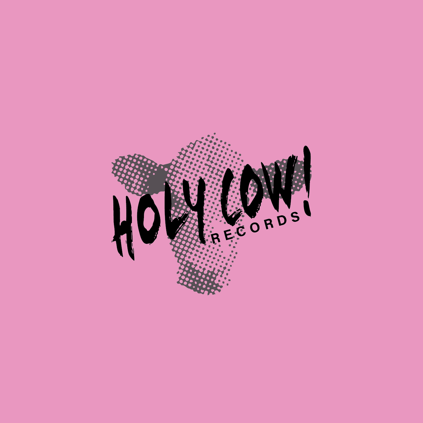
The Holy Cow Records rebrand aimed to emphasize the whimsical and inviting nature of the brand. The logo uses a semi-transparent painted typeface layered over a bitmapped image of a cows head. The bright and contrasting color palette and simplified and modern rustic logo bring the playfulness back into the stores identity. The brand system is given depth by the secondary elements playing on the many meanings and visuals of the phrase "holy cow!".


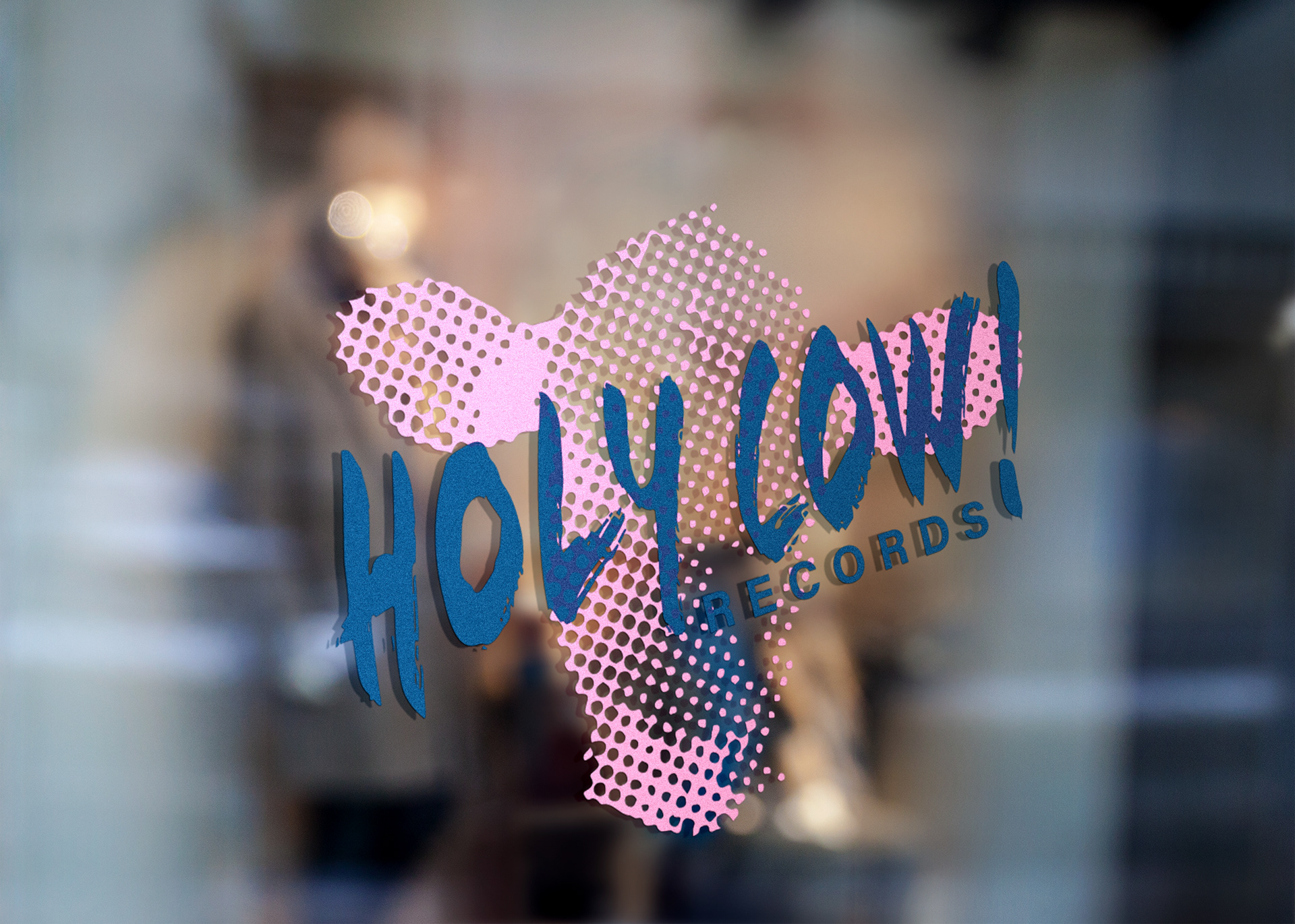
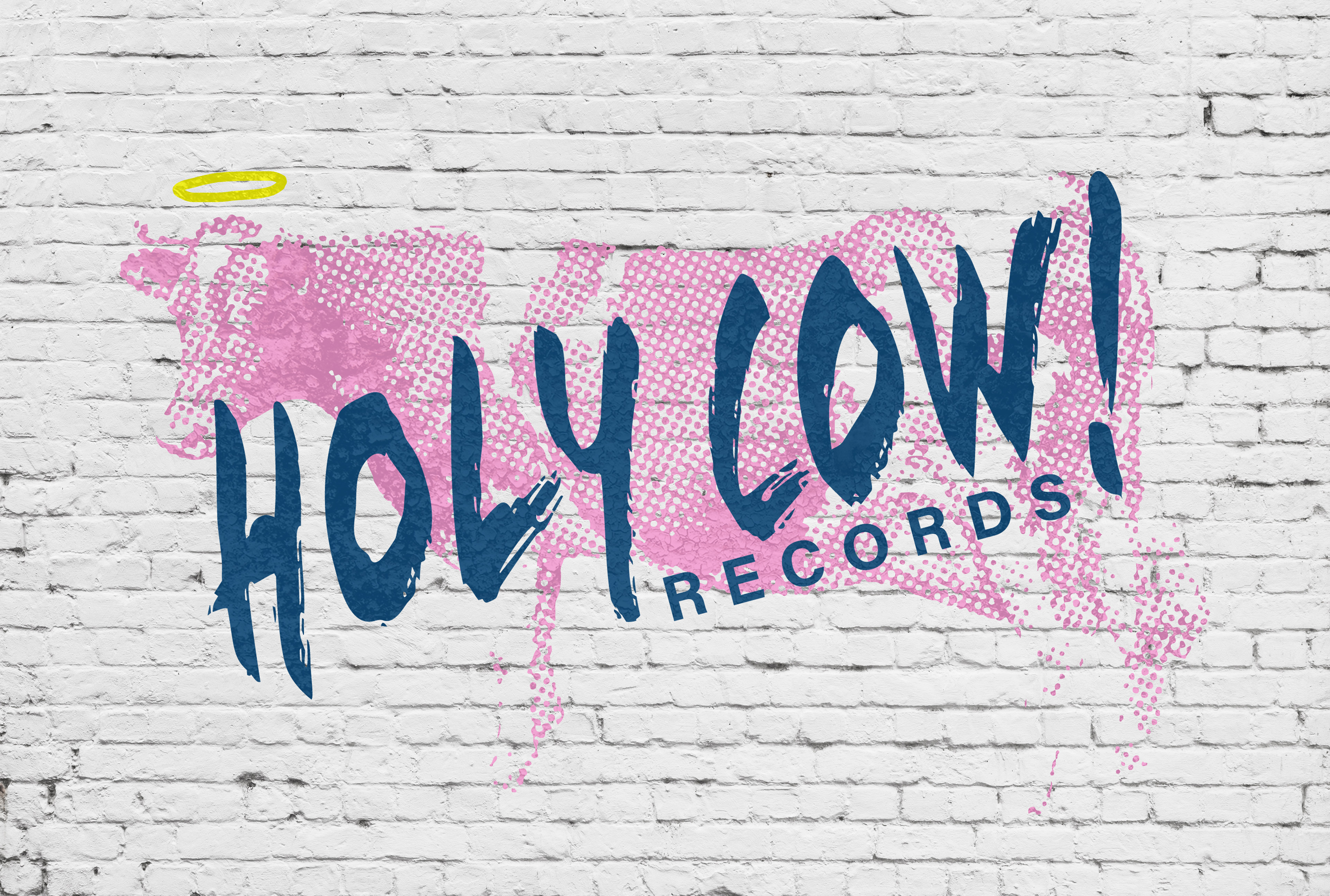


Mockups from graphicburger.com and mockupworld.com