This rebrand was part of a packaging design project. The brand, Emma Reichart, is a wine sold solely at Trader Joes stores. Because of it's small and specific market, my partner and I found it to be a good brand to give a facelift to. The wine is sold at just $4.99 and succeeds at being the most popular rosé sold in Trader Joes. Because of this low price point and the pre-existing popularity of the brand, my partner and I approached a rebrand with the goal of creating a younger feel to the visual identity of the brand.
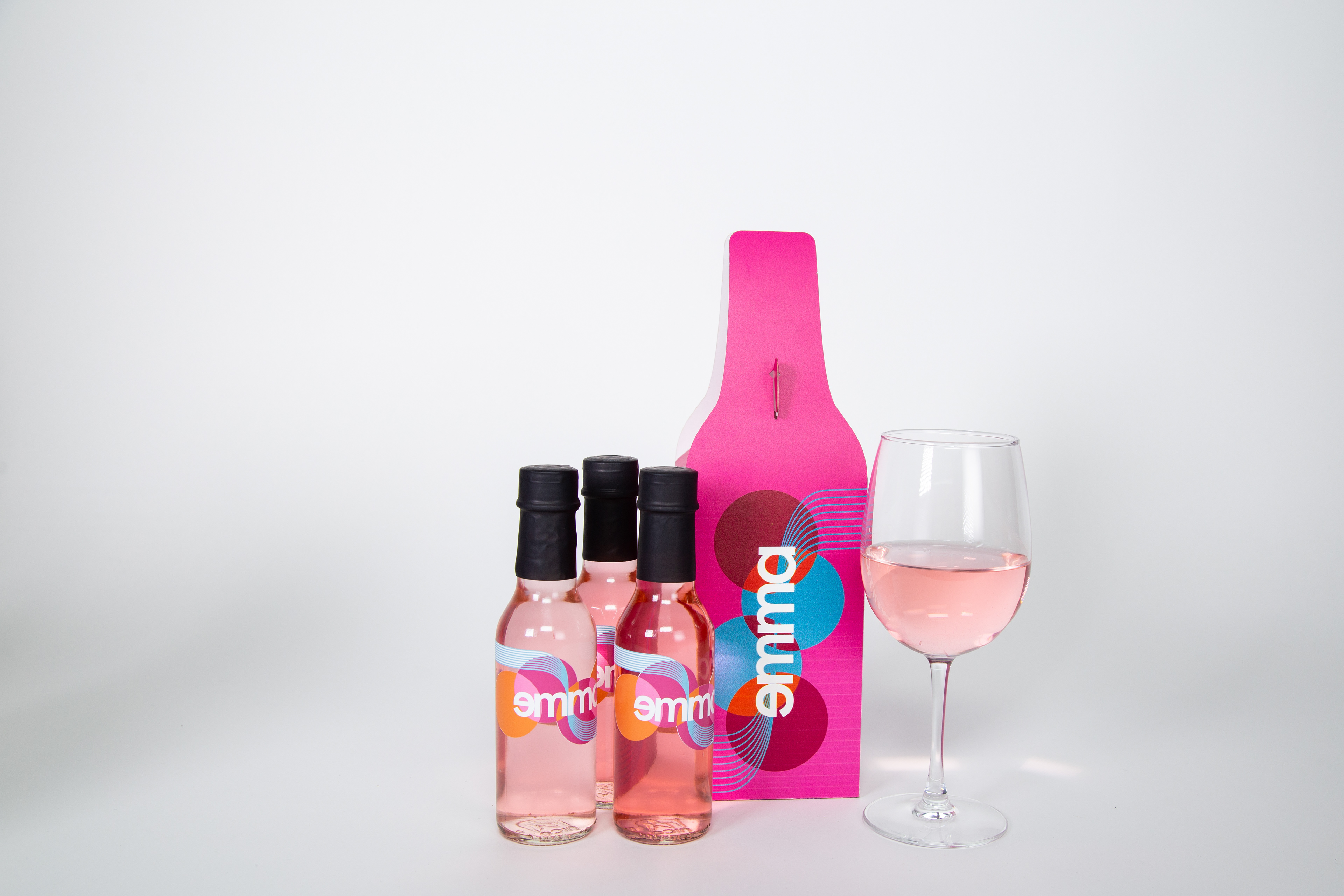
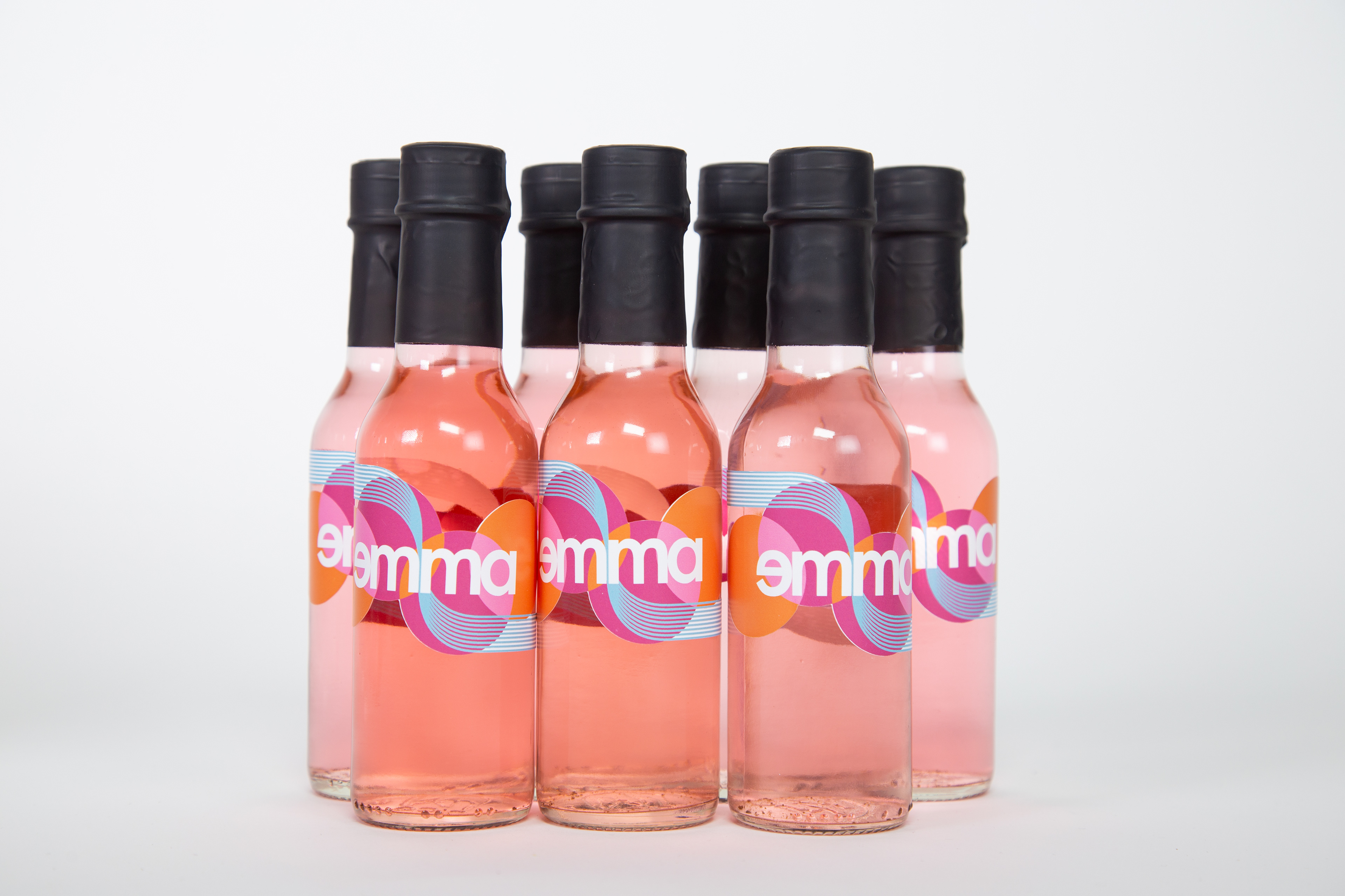
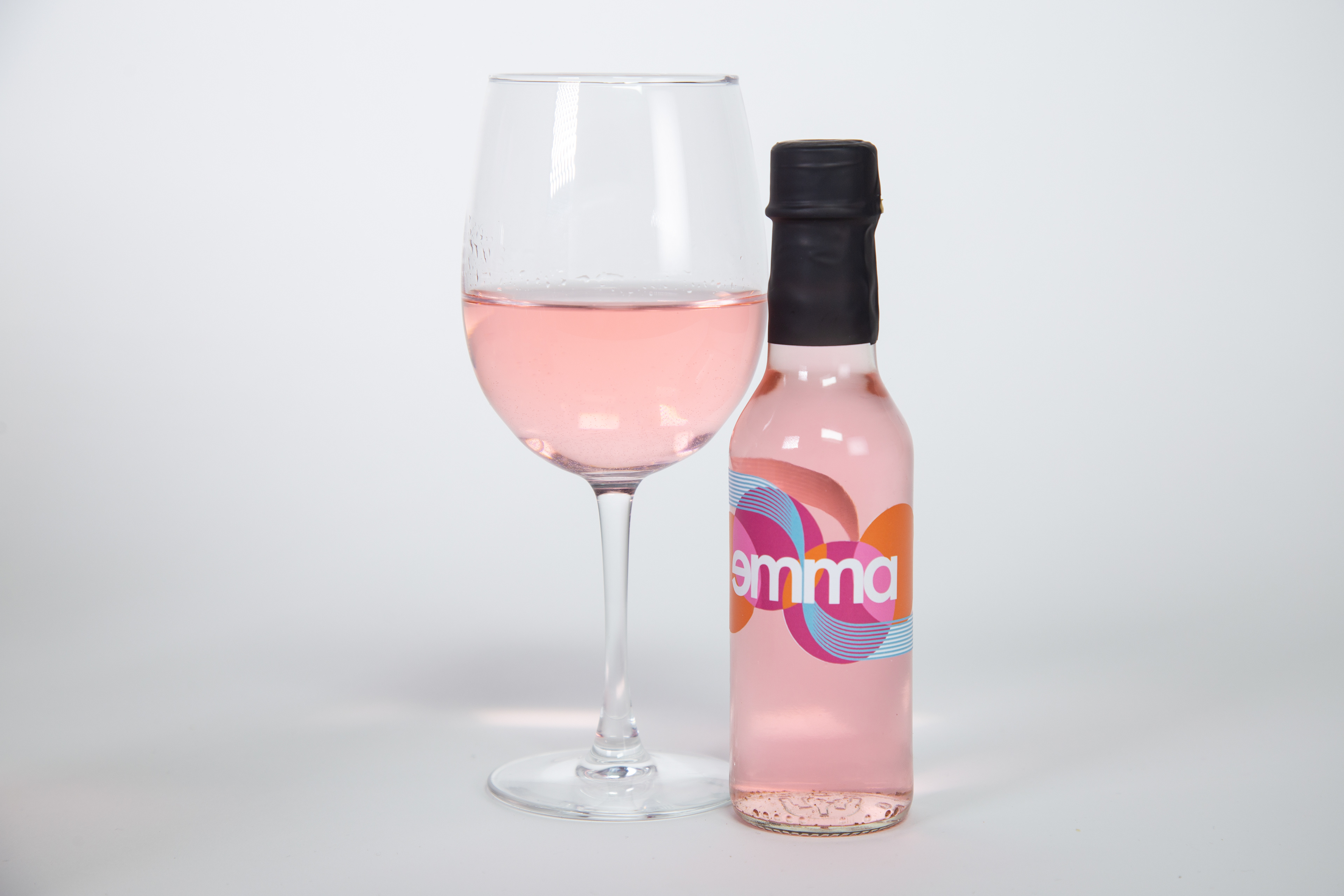
After extensive market research, we found a rising trend in single-serve wine bottles and cans. We took this research into our rebrand and chose to create a four-pack of glass bottles, sold at the same price-point as the full size bottle. The bottles are packaged neatly in an easy-to-carry box and the logo and colors are fun, eccentric, and youthful. The packaging was designed with the goal of standing out on a shelf full of dull wine labels.


Brand Guide
The new branding for emma was inspired by bauhaus German art. The shapes draw directly from the bauhaus art movement and the colors were chosen to create a young and feminine feel to the brand. The typeface aims to mimic that of bauhaus with its geometric shape and modern feel.
The brand system is relatively simple as the wine is sold solely in Trader Joes stores. Design elements include sticker labels for the bottles and a box-carrier to hold four mini bottles each, equivalent to one bottle of wine.

