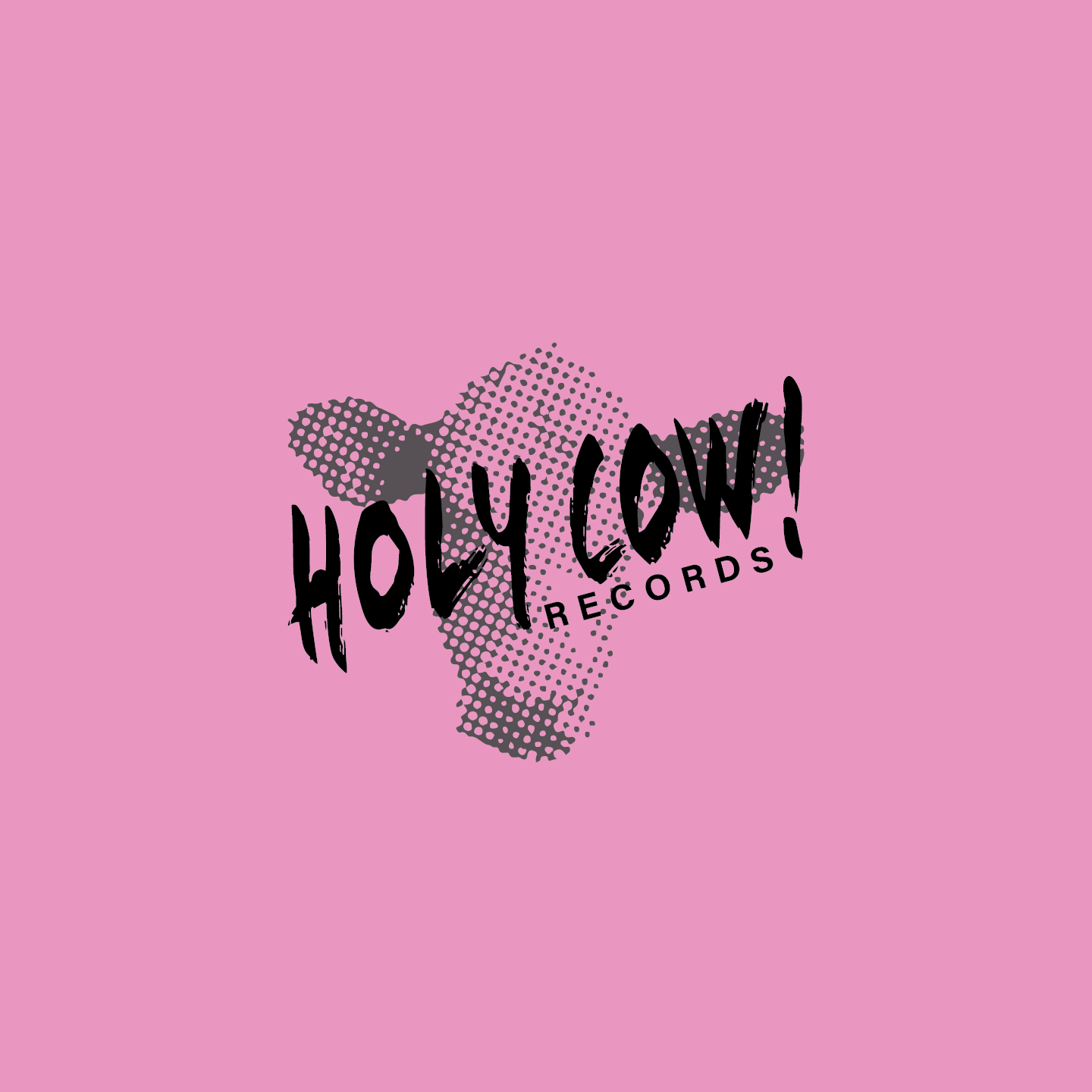

This rebrand was for a small record shop located in the infamous Pike Place Market in Seattle. The rebrand was done as part of a branding class. The project included an extensive period of research in order to determine the brands personality and establish a cohesive brand.
The Holy Cow Records rebrand aimed to emphasize the whimsical and inviting nature of the brand. The logo uses a semi-transparent painted typeface layered over a bitmapped image of a cows head. The bright and contrasting color palette and simplified and modern rustic logo bring the playfulness back into the stores identity. The brand system is given depth by the secondary elements playing on the many meanings and visuals of the phrase "holy cow!".


