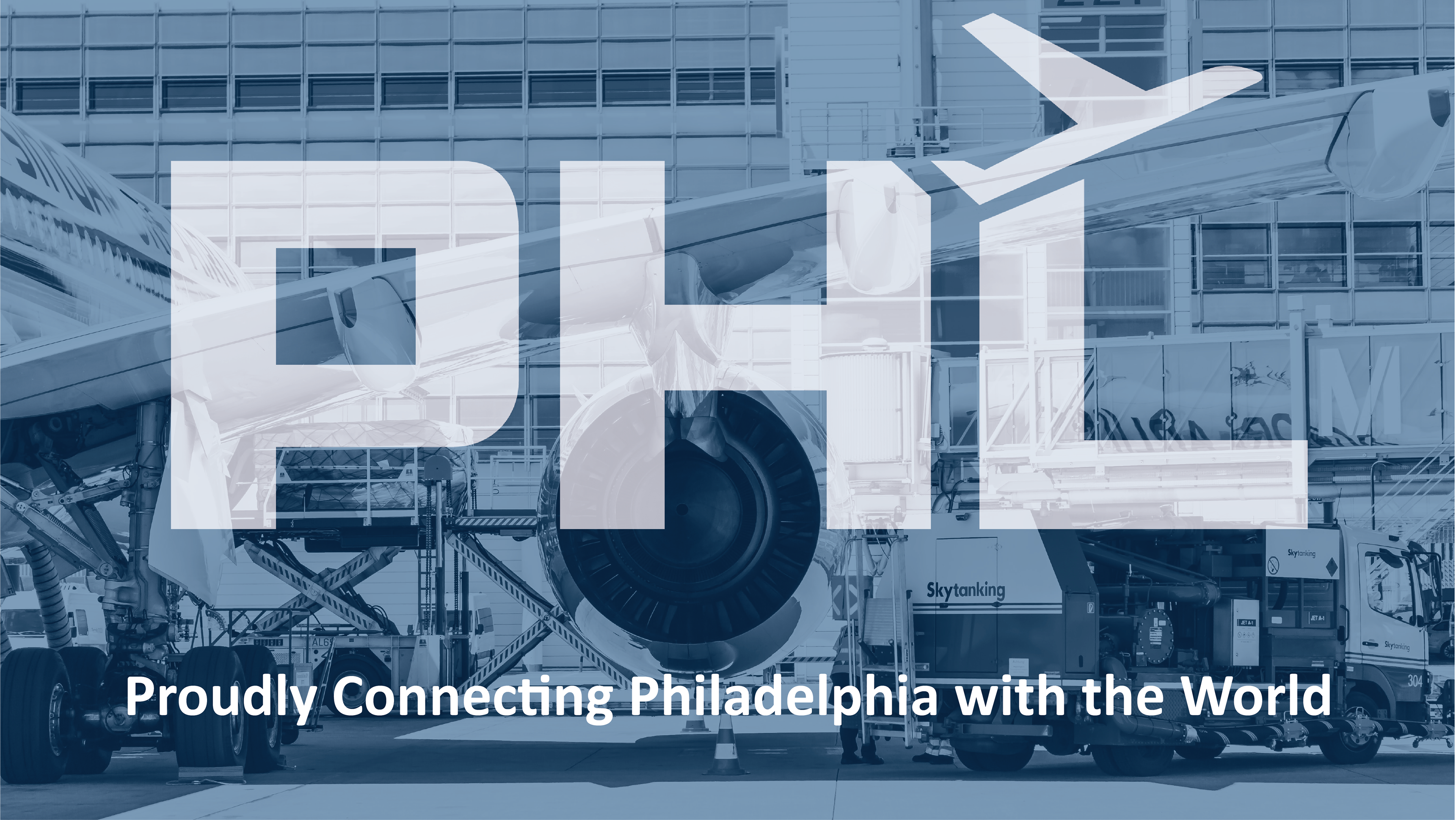
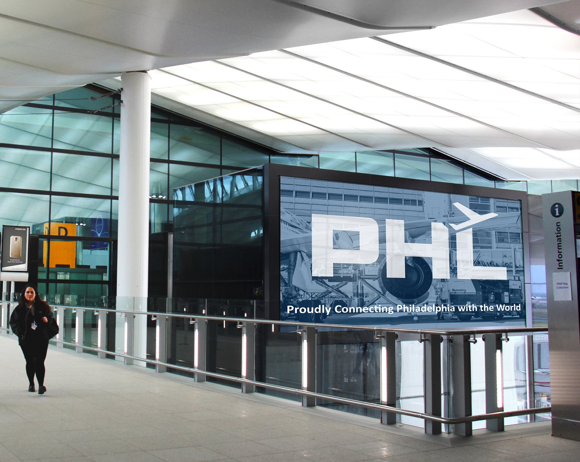
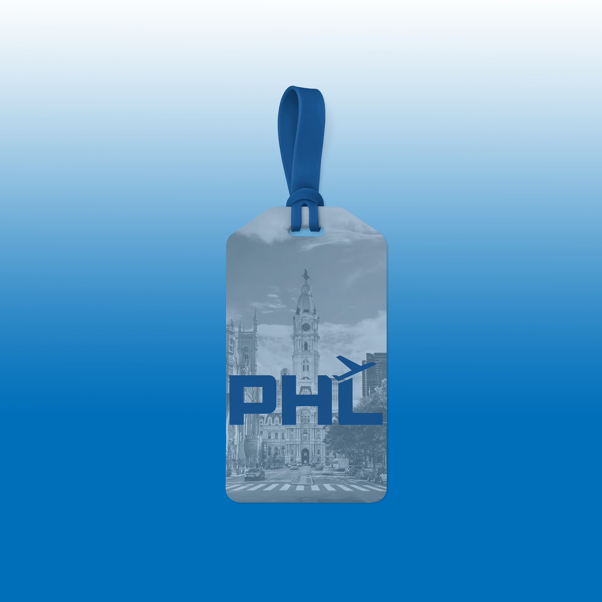
The PHL rebrand aimed to focus on the boldness, history, and pride of Philadelphia. PHL is proud to be connecting Philadelphia with the world and it was important that this pride was present in the visual aspects of the brand.
The previous logo was too simple and generic. The logo and overall branding before failed to portray the personality behind PHL and its connection to the city of Philadelphia.
The new logo is simple and bold, using a large san serif typeface with a simplified airplane image. The logo is simple so that the rest of the branding can speak towards the personality and pride of the city of Philadelphia. Philadelphia has often received criticism from its visitors. The brand aims to take these criticisms and perceived flaws and twist them into strengths, pointing to the character, history, and passion of the city and its people.


